Onboarding is the lesser evil of app development: all professionals engaged in mobile products understand that in an ideal world, the value of apps should be understood intuitively, but sometimes that's not possible.
Onboarding development has become one of the keys to an app’s success over the years. A bad feeling in a user’s first landing in an app may be a feeling that conditions the rest of the user experience. It is therefore one of the key elements in prototyping and phasing for the development of a product with these characteristics. The visual design and the best principles of mobile usability are elementary for its success.
Most onboardings have several screens where an app’s creators maintain some dialog with the user: it is the most effective vehicle to explain the style of a tutorial, what an application consists of and what points of value that product brings to the lives of consumers. The onboarding of a mobile app can, generally, be formed by these types of views:
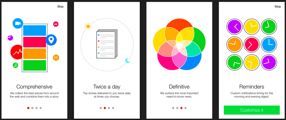
●Splash screen: the initial presentation of any app. It usually consists of the app’s main white or colored background, its logo or icon and also the product name. It is common to use floating buttons and animations in the splash screen. This is the splash screen of an app as commonly used as Google Translate.
●Tutorial: may be formed by one or more views. The idea is to convey to the user what the key elements of the application are, from browsing environments to high-value features. The goal is not to be boring but convey to the user why they must have the app on their phone. Here’s the tutorial for a news app: Yahoo News Digest.
●Registro/login: in the event that the app is going to need to have personal customer data to customize the user experience.
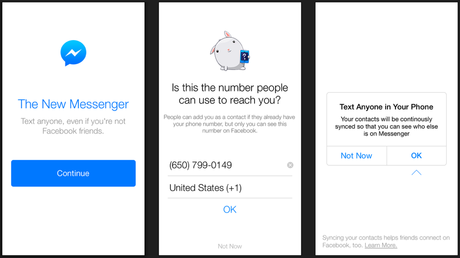
●Notificaciones/permisos de acceso: in the same way that developers may need a registration, they may also have to request access to the camera, microphone, photo gallery or location, among others. Permissions are needed for all those that must be provided by the user, some in the actual onboarding process and others within the app. The Facebook Messenger app requests a user’s phone number in this way:
This is intended as a list with some tips for developing a good onboarding for all profiles involved in designing an application: product, visual designers, usability, programmers…
1. Onboarding, a necessary evil
Some design and usability experts have stated that the best onboarding in the world is the one that doesn’t exist. Many of them think that if an app requires an initial tutorial to explain how it is used and the value it contributes to an app, the chances are that the product is poorly conceptualized, designed and developed.
You must discover its functionality, interest and differential value to the user for yourself while browsing through an app. Less explanatory views, and more usability supported in visual design.
The truth is that nowadays onboarding is necessary in most cases, especially in particularly complex apps that rely heavily on a user interface based on gestures. Gestures that are usually rare and on which the average user still has little knowledge. For example, the use of the side swipe to trigger actions which depends on the use of the app, not as an alternative shortcut to activate these actions. Everyone can recognize the function associated with the typical arrow-shaped back icon, but few have integrated the swipe as a usual navigation movement.
2. Registration or login is a headache
Today user data provide the true value. You either make money by selling a product or through collecting personal consumer information. All product teams have quarrelled over the risk of losing users when requesting their personal data.
An app can be very appealing until the user has to register or login to a social network, either Facebook or Twitter. The timing of subjecting the user to that request is key to ensure retention doesn’t plummet.
So much so that some app stores reject products seeking registration and user login for no apparent reason. The request for a user’s personal data must be, therefore, linked to a value proposition to a specific functionality, which is justified for such registration and login.
There are apps that work with customizing the experience depending on the tastes of users or establishing relationships with communities in their social networks. Making the user understand that registration/login is an essential element to make full use of an app is essential. Una aplicación puede resultar muy interesante hasta que el usuario debe registrarse o hacer login con alguna red social, ya sea Facebook o Twitter. El momento escogido para someter al usuario a esa petición es clave para que la retención no caiga en picado.
3. More requests for personal information
Sometimes the user is not only prompted for a registration/login, they are prompted for other personal data that affect the user experience (age or sex, for example) or permit access to elements of the device that are required for certain features: sending notifications, access to the camera, microphone, image gallery, location, etc. It’s also interesting to see the user make access easier, you can also restrict or modify it at any time via the settings.
4. More images than text
The idea of onboarding is that it doesn’t use up too much of the user’s time. They want to see the app as soon as possible and developers explain their value to increase retention. In the medium term it’s the key: it’s not necessary to design eternal onboardings that bore you or overuse of text for the tutorial.
Therefore the use of icons or dynamic images with transitions or animations is very common. They usually generate more commitment, are more intuitive and also more entertaining. Developing apps is providing value to the user.
5. Measure, measure, measure
One thing is to have a guide with clear concepts to avoid mistakes, and another that is very different is that in that conceptualization, design and development process they are not discussed in the end. For that reason it’s important to measure, measure, measure. Before release through user testing, and then through incorporating different analytical tools in the app.
●User test tool: the goal is to move the prototype to a navigable user interface to detect usability failures or anticipate features of little value. Some interesting tools are Invision, Facebook Origami and Lookback, which are used for navigable prototyping and recording interfaces and the user’s gestures while navigating the view or using the different functionalities.
●Measuring tools: this includes all kinds of platforms to create heat maps or A/B testing. Heat maps can be a great tool for making decisions about the various calls to action in a registration or login view, for example. They serve to detect whether users register more with Facebook, Twitter or email. A/B testing allows professionals to know the best option at a certain time; they can thus detect positions, colors or messages with a better click-through rate (CTR) than other alternatives. Interesting tools for A/B testing: Apptimize and Optimizely.
In the dynamic world of payments, a new star has emerged in recent years: Buy Now Pay Later (BNPL), i.e. short-term financing that allows you to buy now and pay later. This model allows businesses to purchase goods or services and pay for them in installments, often interest-free, making it an attractive alternative to credit […]
BBVA and Vecttor, Cabify’s subsidiary engaged in managing vehicles with drivers, have entered into an alliance that saves time and provides security to the company and its drivers. The collaboration allows drivers to deposit cash collections at any BBVA ATM and Vecttor to automatically reconcile this activity from their accounts with those in the company’s […]
BBVA has been recognized by Global Finance as the bank with the best global open banking offer for companies. This award comes on top of 12 other recognitions the magazine has bestowed on the company, such as the best bank for corporate clients and the one recognizing its AI factory as one of the best […]
Please, if you can't find it, check your spam folder
×
The email message with your ebook is on the way
We have sent you two messages. One with the requested ebook and one to confirm your email address and start receiving the newsletter and/or other commercial communications from BBVA API_Market
×
PROCESSING OF PERSONAL DATA
Who is the Data Controller of your personal data?
Banco Bilbao Vizcaya Argentaria, S.A. (“BBVA“) with registered address at Plaza de San Nicolás 4, 48005, Bilbao, España and Tax ID number A-48265169 . Email address: contact.bbvaapimarket@bbva.com
What for and why does BBVA use your personal data for?
For those activities among the following for which you give your consent by checking the corresponding box:
to receive newsletter from BBVA API_Market through electronic means;
to send you commercial communications, events and surveys relating to BBVA API_Market to the e-mail address you have provided.
For how long we will keep your data?
We will keep your data until you unsubscribe from receiving our newsletter or, if applicable, the commercial communications, events and surveys to which you have subscribed. Whether you unsubscribe or whether BBVA decides to end the service, your details will be deleted.
How can I unsubscribe to stop receiving newsletters and/or communications from BBVA API_Market?
You can unsubscribe at any time and without need to indicate any justification, by sending an email to the following address: contact.bbvaapimarket@bbva.com
To whom will we communicate your data?
We will not transfer your personal data to third parties, unless it is mandatory by a law or if you have previously agreed to do so.
What are your rights when you provide us with your information?
You will be able to consult your personal data included in BBVA files (access right)
You can modify your personal data when they are inaccurate (correction right)
You may request that your personal data not be processed (opposition right)
You may request your personal data be deleted (suppression right)
You can request a limitation on the processing of your data in the allowed cases (right of limitation of processing)
You will be able to receive, in electronic format, the personal data you have provided to us, as well as to transmit them to another entity (portability right)
You are responsible for the accuracy of the personal data you provide to BBVA and to keep them duly updated. If you believe that we have not processed your personal data in accordance with regulations, you can contact the Data Protection Officer of BBVA at the following address dpogrupobbva@bbva.com.
You can find more information in the “Personal Data Protection Policy” document on this website.
×
PROCESSING OF PERSONAL DATA
Who is the Data Controller of your personal data? Banco Bilbao Vizcaya Argentaria, S.A (“BBVA“), with registered address at Plaza de San Nicolás 4, 48005, Bilbao, España, and Tax ID No. A-48265169. Email address:contact.bbvaapimarket@bbva.com
What for and why does BBVA use your personal data for?
For the execution and management of your request, specifically, download the requested e-book/s.
BBVA informs you that, unless you indicate your opposition by sending an email to the following address: contact.bbvaapimarket@bbva.com, BBVA may send you commercial communications, surveys and events related to products and/or services of BBVA API Market through electronic means.
For how long we will keep your data?
We will keep your data as long as necessary for the management of your request, and to receive commercial communications, events and surveys. BBVA will keep your data until you unsubscribe to stop receiving our newsletters or, where appropriate, until the end of the service. Afterwards, we will destroy your data.
How can I unsubscribe to stop receiving newsletters and/or communications from BBVA API Market?
You can unsubscribe at any time and without need to indicate any justification, by sending an email to the following address: contact.bbvaapimarket@bbva.com
To whom will we communicate your data?
We will not transfer your personal data to third parties, unless it is mandatory by a law or if you have previously agreed to do so.
What are your rights when you provide us with your information?
You will be able to consult your personal data included in BBVA files (access right)
You can modify your personal data when they are inaccurate (correction right)
You may request that your personal data not be processed (opposition right)
You may request your personal data be deleted (suppression right)
You can request a limitation on the processing of your data in the allowed cases (right of limitation of processing)
You will be able to receive, in electronic format, the personal data you have provided to us, as well as to transmit them to another entity (portability right)
You can exercise before BBVA the aforementioned rights through the following address: contact.bbvaapimarket@bbva.com
You are responsible for the accuracy of the personal data you provide to BBVA and to keep them duly updated.
If you believe that we have not processed your personal data in accordance with the regulations, you can contact the Data Protection Officer at the following address: dpogrupobbva@bbva.com
You can find more information in the “Personal Data Protection Policy” document on this website.
Banco Bilbao Vizcaya Argentaria, S.A. owner of this portal uses cookies and/or similar technologies of its own and third parties for the purposes of personalization, analytics, behavioral advertising or advertising related to your preferences based on a profile prepared from your browsing habits (e.g. pages visited). If you wish to obtain more detailed information, consult our Cookies Policy.
Cookie settings panel
These are the advanced settings for first-party and third-party cookies. Here you can change the parameters that will affect your browsing experience on this website.
Technical Cookies (required)
These cookies are used to give you secure access to areas with personal information and to identify you when you log in.
Name
Owner
Duration
Description
gobp.lang
BBVA
1 month
Language preference
aceptarCookies
BBVA
1 year
Configuration Accepted Cookies
_abck
BBVA
1 year
Helps protect against malicious website attacks
bm_sz
BBVA
4 hours
Helps protect against malicious website attacks
ADRUM_BTs
Salesforce Marketing Cloud
Session
Required for monitoring of the service, inherent to SFMC
ADRUM_BT1
Salesforce Marketing Cloud
Session
Required for monitoring of the service, inherent to SFMC
ADRUM_BTa
Salesforce Marketing Cloud
Session
Required for monitoring of the service, inherent to SFMC
ADRUM_BT
Salesforce Marketing Cloud
Session
Required for monitoring of the service, inherent to SFMC
xt_0d95e
Salesforce Marketing Cloud
Session
Remember user preferences (if any)
__s9744cdb192d044faa1bf201d29fafd1e
Salesforce Marketing Cloud
Session
Remember user preferences (if any)
wpml_browser_redirect_test
WPML
Session
Text translation in the portal
wp-wpml_current_language
WPML
24 hours
Text translation in the portal
They are used to track the activity or number of visits anonymously. Thanks to them we can constantly improve your browsing experience
Your browsing experience is constantly improving.
With your selection, we cannot offer you a continuously improved browsing experience.
Name
Owner
Duration
Description
AMCV_***
Adobe Analytics
Session
Unique Visitor IDs used in Cloud Marketing solutions
AMCVS_***
Adobe Analytics
2 years
Unique Visitor IDs used in Cloud Marketing solutions
demdex (safari)
Adobe Analytics
180 days
Create and store unique and persistent identifiers
sessionID
Adobe Analytics
Session
Launch's internal cookie used to identify the user
gpv_URL
Adobe Analytics
Session
Adobe Analytics plugin: getPreviousValue Capture the value of a certain variable in the following page view, in this case the prop1
gpv_level1
Adobe Analytics
Session
Cookie used to store the DataLayer levl1 of the previous page.
gpv_pageIntent
Adobe Analytics
Session
Cookie used to store the pageIntent of the previous page.
gpv_pageName
Adobe Analytics
Session
Cookie used to store the pagename of the previous page.
aocs
Adobe Analytics
Session
Cookie that stores the first values collected at the beginning of a process.
TTC
Adobe Analytics
Session
Cookie used to store the time between the App Page Visit event and the App Completed event.
TTCL
Adobe Analytics
Session
Cookie used to store the time between the LogIn event and App Completed.
s_cc
Adobe Analytics
Session
Determine if cookies are active
s_hc
Adobe Analytics
Session
Cookie used by Adobe for analytical purposes
s_ht
Adobe Analytics
Session
Cookie used by Adobe for analytical purposes
s_nr
Adobe Analytics
2 years
Determine the number of user visits
s_ppv
Adobe Analytics
Permanent
Adobe Analytics plugin: getPercentPageViewed Determine what percentage of the page a user views
s_sq
Adobe Analytics
Session
ClickMap/ActivityMap features
s_tp
Adobe Analytics
Session
Cookie used by Adobe for analytical purposes
s_visit
Adobe Analytics
2 years
Cookie used by Adobe to know when a session has been started.
They allow the advertising shown to you to be customized and relevant to you. Thanks to these cookies, you will not see ads that you are not interested in.
The advertising is customized to you and your preferences.
Your choice means you will not see customized ads, only generic ones.
Name
Owner
Duration
Description
OT2
VersaTag
90 days
VersaTag Cookie used to store a user id and the number of user visits.
u2
VersaTag
90 days
VersaTag Cookie where the user ID is stored
TargetingInfo 2
MediaMind
1 year
Cookie that serves to assign a unique random number that generates MediaMind.
These cookies are related to general features such as the browser you use.
Your experience and content have been customized.
With your selection, we cannot offer you a continuously improved browsing experience.
Name
Owner
Duration
Description
mbox
Adobe Target
9 days
Cookie used by Adobe Target to test user experience customization.
×
Looks like you’re browsing from MexicoSpainArgentinaPeruColombiaBelgiumChileUSAFranceHong KongItalyPortugalUnited KingdomTurkeyUruguayVenezuelaAlemania, so let’s show you the custom content for your
location. Change
Select a country
In order to access the private area and corresponding sandbox, select the country of the APIs you want to use.