There are elements that regularly pose a potential danger for the responsive design of a website not being maintained over time or broken for some reason. This is a big problem because Google already decided some time ago that it will reward in searches those websites that have a design adapted to mobile devices. An effective way to achieve this is to implement a responsive design. This is not incidental; months ago the search engine even launched its own mobile-adapted front-end product: AMP (Accelerated Mobile Page).
Some elements that often cause problems when adapting designs to different mobile devices are images, videos and the external content inserted in news through iframe HTML elements. When a user has a website in WordPress (possibly the best-known and used CMS in the world), images, videos or special external content can be a motive to ‘break’ the template’s design and lead to the style adapted to tablets or mobiles to stop working.
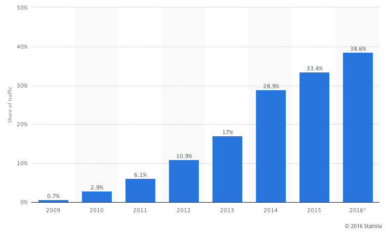
According to the statistics page Statista, the percentage of mobile traffic has been growing since 2009, the year in which the volume was almost non-existent (0.7%). At the end of 2015, the average percentage increased to 33.4%. In 2016, still to close, that figure has now reached almost 40% (mobile traffic has already reached 38.6% of total digital traffic to web pages). Today there are projects where due to their user profile or as they were created in the smartphone era, their mobile traffic exceeds 60%. It’s certainly true that the future is mobile and any project must be adapted to the smartphone era. This progression graph leaves no doubt.
Processing images in responsive designs
One of the great advantages of HTML5 is image processing for cross-platform websites, and especially designs adapted to smartphones. These developments are summarized in the inclusion of the srcset attribute to load images in the content of web pages, i.e. those that are loaded in rendering the browser using the HTML tag <img src=”url.jpg” />. With the srcset attribute inserted into this label we can have responsive content images in WordPress without using JavaScript or plugins.
What exactly does the srcset attribute permit? It permits defining within the tag different versions of the image to display one or the other depending on the type of screen; it logically leverages the cuts that by defect are smaller that WordPress makes by default to each of the images to be uploaded to the multimedia gallery. It can, therefore, place a srcset attribute to determine both the size of the image by display type and density in pixels. The code would look something like this: 480w indicates that it is an image (small-photo.jpg) for displays with a width equal to or less than 480 px; 1024w for an image (big-photo.jpg) for screens smaller than or equal to1024px; and 2x for images for screens with dual pixel density.
<img src=”low-density-photo.jpg”
srcset=”small-photo.jpg 480w,
big-photo.jpg 1024w,
high-density-photo.jpg 1024w 2x” />
The really interesting thing is that, from version 4.4 of WordPress, this CMS adds by default the srcset attribute to each of the images that the user uploads to its gallery, and includes within the various cuts that it makes by default maintaining the proportion of the original photo: original size, large size at1024px, medium size at 768px, medium at 300px and miniature at 150px. Almost all browsers today support the HTML5 srcset attribute.
Video: responsive adaptation
Something similar happens with video as with images. You can make it adapt to 100% of the screen and also set a maximum width for certain screens. In HTML5, as with images the <img> label is used with the attribute srcset, with videos the <video> label is used. It’s as simple as that. Snippets to adapt a video to a responsive design, without the need to retouch JavaScript code or use a WordPress plugin:
● To the default width that screen has:
video {
width:100%;
}
● To the default width of the screen, but with a maximum width when the screen grows, to prevent, for example, an excessive size in the desktop.
video {
width:100%;
max-width:640px;
}
Responsive design in WordPress?: it uses plugins
Ensuring that a website in WordPress is adapted to mobile devices can be as simple a matter as choosing a plugin. Here are some of the add-ons that allow you to adjust all content to smartphones:
WPtouch Mobile Plugin: this plugin allows users to add a mobile version of any website created in WordPress with a specific theme. The aim of WPtouch Mobile Plugin is to adjust websites to the requirements that Google imposes to take full advantage of capturing all organic traffic in searches. What the plugin does is adapt all content (images, videos or special content) to the different screens of different mobile devices in one fell swoop. It’s possibly one of the most downloaded WordPress add-ons for this purpose: it has more than 9.5 million downloads within the repository.
● WP Mobile Edition: this plugin automatically detects when the user visits a website via a mobile device and serves the mobile theme. If this is not the case, by default it displays the primary WordPress desktop theme. In any case it gives the user the option to consume the content with the desktop version, even though you are viewing from a mobile. The idea of the plugin is not only to provide mobile themes, but loading times are particularly low (one of Google’s priorities). It also has smart formatting to rotate the device to the user’s movement, comments from other plugins such as Disqus, it provides eight different color palettes from the configuration.
Are you interested in financial APIs? Go to the BBVA catalog