The digital universe is reaching new thresholds. The amount of data generated by both private users and companies is growing at a rapid pace. Actually, according to a study by IDC and EMC, the world of digital data is doubling its size every two years, and in 2020 it will have generated 44 zettabytes of information, or what is the same: 44 trillion gigabytes of structured and unstructured data.
The fact of creating and accessing a website, participating in a blog, increasing our number of followers, post comments, send a tweet or just surfing the internet produces a whole range of data that, if exploited properly, can be of great value for companies.
The big challenge, however, is to make sense of all that data. That is, to be able to capture, link, analyze and extract its true value, so that the information can be presented in an attractive, clear, concise and understandable manner, facilitating decision making in your business. Exploring and analyzing visually customers’ data can also take you to discover new ways to reach them, create a better segmentation, personalized offers for products or services, and generate innovative ideas, among many other possibilities which can contribute to maintain the engagement between your brand and your users over time.
Where to start
The first steps in data visualization may be intimidating. Fortunately, the same way data is growing, so do the tools that help us get the most out of it.
Here we present the five tools that we consider the best, based on the capabilities they provide and the level of experience required.
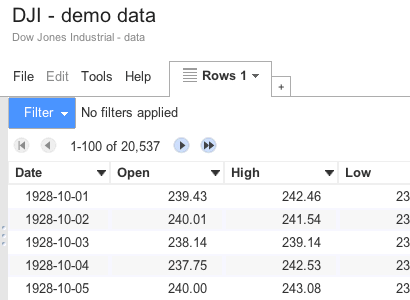
Google Fusion Tables
It’s an excellent tool for beginners or for those who don’t know programming. For more advanced users there is an API that allows to produce graphics or maps from information.
One of the advantages of this application is the diversity of data representations it offers. It also offers a relatively fast way to create graphics and maps, including GIS functions to analyze data by geographic area.
This tool is used frequently by The Guardian to produce detailed maps very quickly.
CartoDB
This is an open source service directed to any user, regardless his technical level, with a friendly interface. It allows to create a variety of interactive maps, choosing from a catalog of options (which includes Google Maps) or adding your own customized maps.
The most interesting feature of this tool is that it lets you access Twitter’s data to see how users react to a brand, a particular marketing campaign or event. We can see a good example of this on the map tracking tweets that was created last year with the launch of Beyoncé’s latest album. It shows clearly the places where the release had more impact. This is a great source of visual information for marketing professionals and businesses.
It should also be highlighted that it has an active group of developers who provide extensive documentation and examples. In addition, the open nature of its API allows to create continuously new integrations and to increase the capabilities of the tool with new libraries..
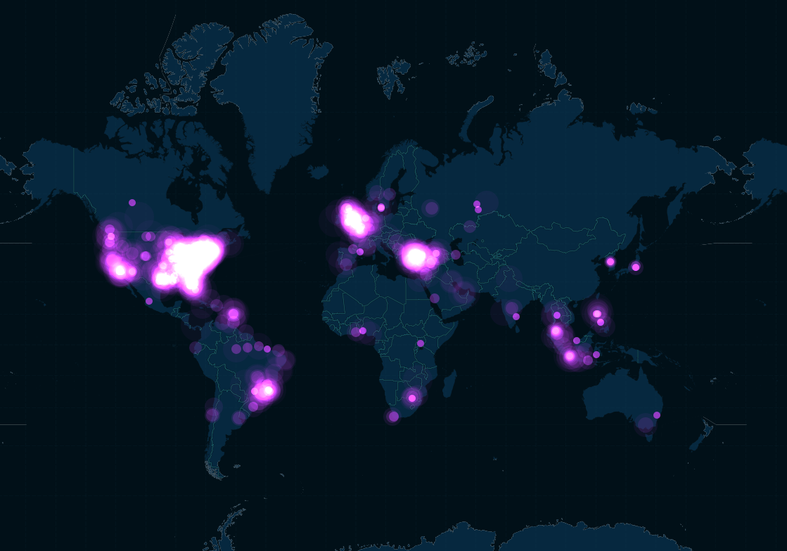
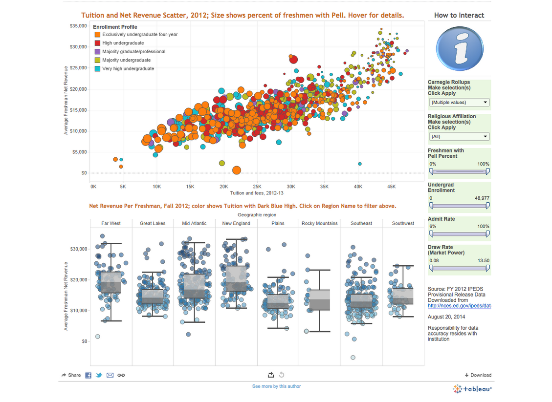
Tableau Public
With Tableau Public you can create easily interactive maps, bar and pie charts, etc. One of its advantages is that, like Google Fusion Tables, you can import tables from Excel to facilitate your work. In a matter of minutes you can generate an interactive graphic, embed it in your website and share it. For example, the news portal Global Post created with it a series of charts about the best countries to do business in Africa.
In the recently released 8.2 version we can also find the new OpenStreetMap tool, which allows to produce very detailed maps from local data such as cafes or shops. Tableau Public is a free tool, although it also has a premium version.
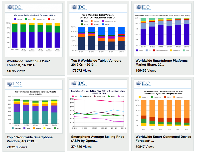
iCharts
You can get started in the world of data visualization with the service offered by iCharts, which has a free version (Basic) and two premium options (Platinum and Enterprise). With this tool you can create visualizations in just a few steps, exporting Excel and Google Drive documents or adding data manually.
Through this tool it is possible to share your graphics with your collaborators privately, besides being able to edit and update them with new data through its cloud computing service. You can even share them with your clients through emails, newsletters or social networks.
Among the companies using this service we find the prestigious consulting firm IDC, which uses iCharts to provide visual images of relevant data included in its reports..
Smart Data Report
Finally, we also recommend Smart Data Report, which is not a tool as powerful as the previous ones but has the advantage of being an affordable data solution for entrepreneurs and small businesses whose workers don’t have much spare time.
Among other services, this website offers free data analysis and the option to receive reports by email, without having to create them yourself. Once the service has your report ready, it generates an HTML code that you can embed in your corporate website or in your articles..